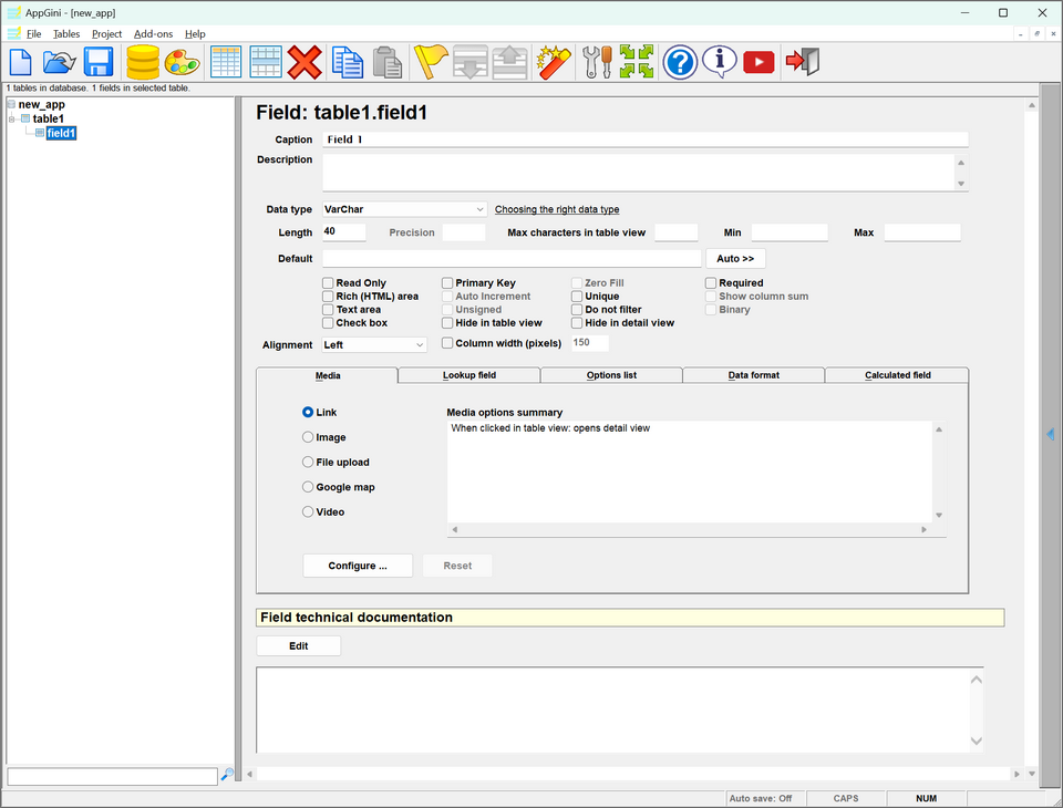
Field properties pane
Caption
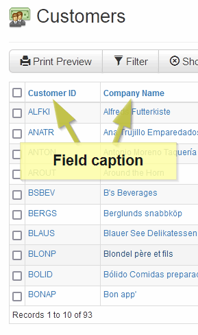
The field caption is the title of the field as it would appear in the table view and the detail view of its table in the generated web application.
Description
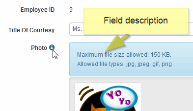
This section allows you to provide an optional description for the field.
Data Type
(Dropdown menu) This menu allows you to choose the type of data the field will store in your application's database.
Length
Specifies the maximum size of data that can be stored in this field. The way Length property works depends on the data type you choose for the field.
Precision
This property works with decimal data types only. It specifies how many digits to display after the decimal point.
Max characters in table view
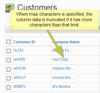
Applicable for textual data types only. Specifies the number of characters to display in the table view for that field. If zero or empty, the entire field value is displayed. This is very useful when you have a long field and you don't want to display all of its contents on the table view to prevent the table view from becoming too wide. Thus you can set it to display just the first 40 characters for example. When users select the record, the full field contents will be displayed in the detail view.
Default
If you specify a default value, it will be placed in any records that the user creates while leaving this field empty (if the user does want an empty field, she can delete the default value after the record has been added and then update the record). If you click the 'Automatic Value' button at the right of the 'Default' box, you can select an automatic value to be inserted into the field when the record is created or changed. This works only if the field is set as read-only.
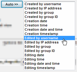
Automatic value
You can set a field to contain one or more automatic values by specifying them from the drop-down menu. The field will be read-only and its value set automatically by the app.
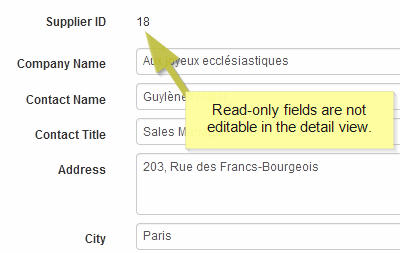
Read Only
If checked, this field will be displayed in the detail view but not editable. This is useful in many scenarios, including forcing a default value (or automatic value), calculated fields, fields that are populated using custom code or a third party app, .. etc.
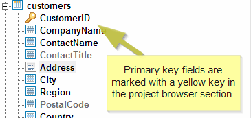
Primary key
If you check this option, the current field will be the primary key of the current table. In AppGini, Every table must have a single primary key field in order to uniquely identify records of the table (multi-field primary keys are not supported by AppGini).
Zero Fill
Check this property to left-pad numeric data types with zeros when they are displayed, so that the total number of digits matches the field's 'Length' property. For example, if the field length is 5 and is set as zero-fill, a field value of 22 would be displayed as 00022.
Required
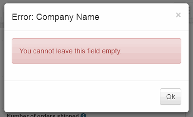
If you check this property, users must provide a value for this field before submitting the form. If a user attempts to submit a record while leaving a required field empty, they'd see an error message similar to the one below. If you set the field as read-only, auto-increment or hidden in detail view, this property will be ignored.
Rich (HTML) area
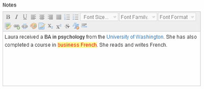
If checked, this field will be displayed as a rich area in the detail view. A rich area provides advanced formatting features not available in a normal text area. For example, you can change the font/font size, colors, add links, add photos, ... etc.
Auto increment
While defining the properties for the ID field (likely named "id"), look for an option labeled "Auto Increment". This option appear as a checkbox with an "Auto Increment" selection.
Unique
The data values in this field cannot be repeated if you check this property. This is similar to the Primary key property except that unique fields can be empty (null). If a user tries to enter a value that already exists into a unique field, they'll see an error message like the one below.
Show column sum
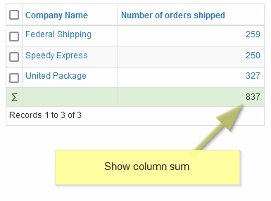
This option is enabled only for numeric fields. Currently, lookup fields are not supported (even if their parents are numeric). If you check this option, the generated table view will include a calculated sum of the values stored in this field for all records. If a filter is applied to the table view, the sum will be calculated only for filtered records rather than all records.
Text area
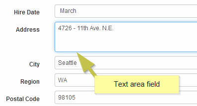
If checked, this field will be displayed as a text area in the detail view. This is useful if you want to allow multiple lines in a field, for example to enter addresses or notes.
Unsigned
This property works for numerical data types only. If you check it, the field will not accept negative data values.
Do not filter
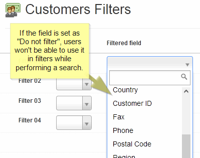
If checked, the current field is not displayed in the filters page. Thus, users will not be able to use this field to filter data.
Binary
This property works only with Char and VarChar data types. It forces the field to behave like a binary value rather than the default text behavior. For example, the list (a,G,x,E,A,g) is sorted as (a,A,E,g,G,x) if it is treated as text values, and (A,E,G,a,g,x) if it is treated as binary values.
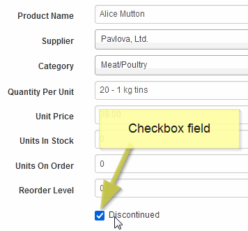
Check box
If you check this property, the field will be displayed as a check box, where users can either check or uncheck it.
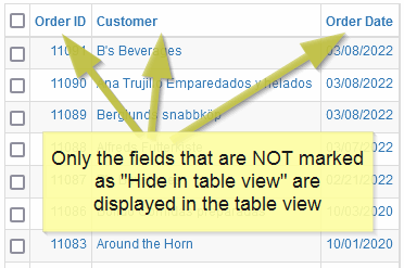
Hide in table view
If checked, the current field is not displayed in the table view. This may be useful if you want to hide some fields or to decrease the width of tables.
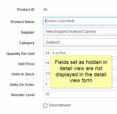
Hide in detail view
If checked, this field will not be displayed in the detail view.
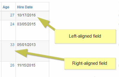
Alignment
Specifies the alignment of the field in the table view.
Column width (pixels)
Specifies the width in pixels of the column that will display data from this field in the table view. Please note that the width specified is the minimum (rather than exact) width. If the total width of all columns in the table view is less than the page width, each column would expand based on the ratio of its specified width to the total table width.
Media, Lookup field, Options list...etc
The various options in these tabs specify the behavior and appearance of the current field.
Media tab > Link
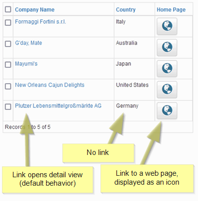
Configures this field as a link to the detail view (the default behavior), a link to a URL, an email link, or no link. Click the 'Configure' button to change the link behavior.
Media tab > Image
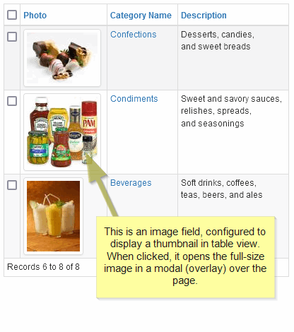
Image Configures this field to accept an image upload and display as a full-size image or a thumbnail.
his works only if the field has a textual data type (Char, Varchar, Text, ..etc). This is because the field actually stores the image file name, while the image itself is uploaded to the storage of the server running your AppGini app.
Media tab > File upload
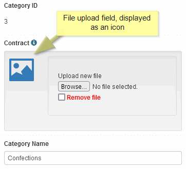
Configures this field as a file upload field. This works only if the field has a textual data type (Char, Varchar, Text, ..etc). This is because the field actually stores the file name, while the file itself is uploaded to the storage of the server running your AppGini app. In the configuration window, you can specify the maximum file size in KB that users are allowed to upload. Also, you can specify whether you want to delete the file from the server if the record is deleted. You can also configure how the field is displayed to users.
Media tab > Google map
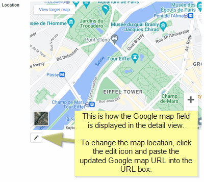
When enabled, this link would accept a Google maps link and would display the related map embedded in the page.
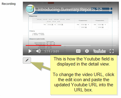
Media tab > Youtube video
When enabled, this link would accept a Youtube link and would display the related video embedded in the page.
Lookup field > Parent table
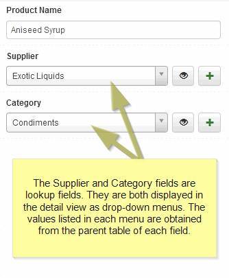
If you want to set this field as a lookup field (foreign key), select its parent table from this menu. A parent table is the table which has the field containing the source data for the lookup field. For more information about lookup fields, refer to the section 'Understanding lookup fields' in the online help.
Lookup field > Advanced ...
The advanced window allows you to specify a custom SQL query for populating the lookup drop-down. You can use this typically to filter the possible values for this lookup field. For example, you can display products that are not discontinued rather than all products by adding a WHERE condition in the SQL query.
Lookup field > Parent caption field 1
If this is a lookup field (foreign key), select the field to be used as the first part of the caption from this menu. A parent caption is the caption or alias that appears to the user in the lookup drop-down. For more information about lookup fields, refer to the section 'Understanding lookup fields' in the online help.
Lookup field > Separator
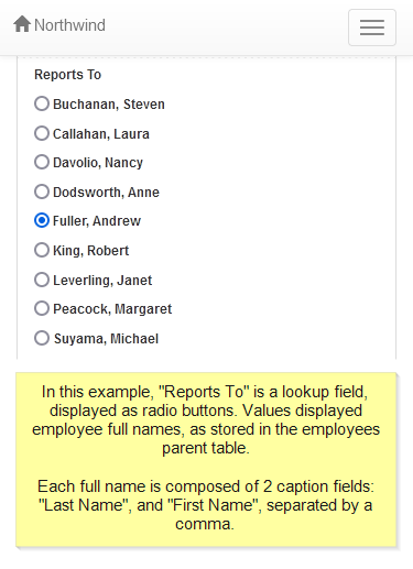
If this is a lookup field (foreign key) and you want its caption to be formed by joining values from 2 caption fields, type a separator here. For example, if part 1 of the caption is a field called 'last_name', and part 2 is a field called 'first_name', you should use a command followed by a space ',' as a separator. See the screenshot below
Lookup field > Parent caption field 2
If this is a lookup field (foreign key), select the field to be used as the second part of the caption from this menu. A parent caption is the caption or alias that appears to the user in the lookup drop-down. For more information about lookup fields, refer to the section 'Understanding lookup fields' in the online help.
Field properties > Show as radio buttons
When this option is checked, the lookup field is displayed as a set of radio buttons rather than a drop down menu. This applies only if the lookup field is not set as 'Auto-fill'.
Field properties > Inherit access permissions
Check this option to limit the contents of the lookup drop down to only the parent records that the logged member is allowed to view. If not checked, all parent records are listed regardless of the member's permissions.
Field properties > Link to parent record in detail view
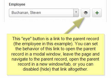
In the detail view, lookup fields can have an adjacent link to the parent record. This drop down specifies whether to show that link, and how the link behaves when clicked.
Options list > List values
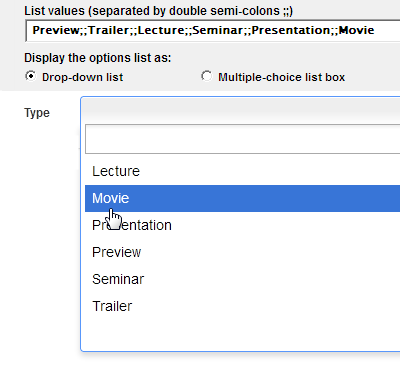
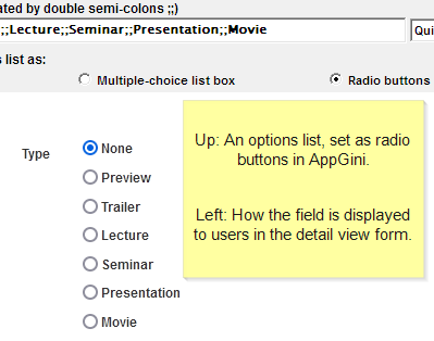
If you want to limit the possible values for a field to a specific list of values, type the allowable values here, separated by double semi-colons. The first screenshot below shows an example of how to specify the list values. The second screenshot below it shows how the field will be displayed to users (options are sorted alphabetically in the drop-down).
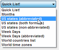
Options list > Quick list!
Choose a popular predefined set of options from the quick list instead of having to type them manually. To add your own predefined list, create a text file containing the list and save it into the 'add-ons' folder inside your AppGini installation folder. The extension of your list file must be '.Ist'.
Options list > Drop-down list
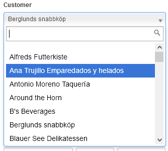
If you choose to display an options list as a drop-down list, users can select a value from the drop-down, and can search for values by typing part of their content in the search box. Recommended if you have a large number of options.
Options list > Multiple-choice list box
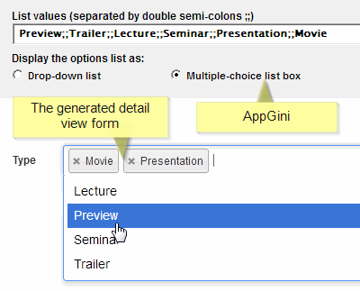
If you choose to display an options list as a multiple-choice list box, users can select one or more values from the drop-down, and can search for values by typing part of their content in the search box. To use this option, the field data type must be a TEXT or BLOB type. The screenshot below shows an example where the user has selected 2 values form the drop-down.
Options list > Radio buttons
If this field is an options list, and you choose to display it as radio buttons, the values of the list are displayed as radio button options, each on a separate line. The advantage of radio buttons is that they are very easy to use and the user can see all the possible options without scrolling. Not recommended though if you have a large number of options, as this will cause the form to become too long. Use a drop-down list in this case. Options are sorted in the same order you enter them if you choose radio buttons. To hide the 'None' option, set the field as required.
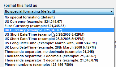
Data format > Format this field as
Use this option if you want to apply a special format to the data stored in this field.
Examples of special formats include currency formats, Date/time formats, ... etc.
You can add or edit data formats by editing the file C:\Program Files\AppGini\add-ons\dataFormats.cfg in a text editor.
Rules: Each data format on a separate line. The line begins with the description of the data format, followed by a semi-colon (;) and a space, followed by the format code (written in MySQL syntax). The description of the data format can't include semi-colons.
Calculated field > Automatically calculate the value of this field using the following SQL query
This is an advanced feature that requires some SQL knowledge. Instead of receiving user input, or a default value, calculated fields are populated by running the specified SQL query, and storing the returned value. The SQL query should return a single value: single row and single column. Use the 'Query helper' button to open an advanced query editor that makes it much easier to build queries. The list of variables at the right allows you to insert special placeholders in the SQL query, to be replaced by their corresponding values before running the query. For more details and examples, please refer to the online help.
Show technical documentation page in the admin area
Technical documentation is a way of adding comments/documentation to your app. If the option 'Show technical documentation page in the admin area' is checked, the documentation will also be visible to the admin user rather than just in AppGini. Documentation text can optionally include HTML code. Bootstrap CSS classes can also be used.
